Overview
$aveNUS is a command line interface (CLI) financial planning application that my team and I designed for CS2103T (Software Engineering) module in School of Computing, National University of Singapore (NUS).
In this project, we morphed the sample address book application into $aveNUS, an application that allows NUS students to track their financial spending with regards to food purchases. Additionally, the application provides them with the best food recommendations within their current budget as well as a savings feature to track their savings.
The table below provides a quick summary of the symbols and formatting used in this portfolio.
|
Command that can be typed into the command box |
|
Success execution of command |
|
Tips that might be useful |
|
Additional information that is good to know |
|
Important pointers to take note |
Summary of contributions
This section provides a summary of the contributions that I have made to the team project.
Major enhancement: UI
I have updated the UI and added numerous front end functions to improve the look and quality of the app.
What it entails
Firstly, I updated the look of the app to give it a more professional look and much more fitting to the purpose of the application.
For example, I added a Wallet section which shows the user’s current amount of money available to be used for purchases.
Another one would be the addition of the statistics tab which allows user to tab through their spending data to get a better understanding of their own spending habits and plan their future spending accordingly.
The font of the application has been carefully selected based on the list of TypeFaces available. This is to allow all users to be able to read the application easily, even those with reading difficulties.
The overall color scheme of the application is a result of hours and hours of brainstorming in which I have managed to successfully come up with color schemes for any theme selected by the user that is not only easy on the eyes, but also stylish in design.
I also added buttons on the menu pane that functions as the single-word commands such as recommend and default.
These buttons function just like typing the commands on the Command Text Box and the icon for each button has been
carefully selected from online database of icons to perfectly match its function.
Justification
The look of the app is the first thing that users see when starting up the application. By having an expertly designed UI, the user will feel more at ease when using the app as it gives a sense of overall professionalism.
The reasoning behind adding enhancements to the UI components such as statistics tab and wallet section is to make the app more convenient to the user. By adding such displays, the user will no longer have to type on the command line just to get the statistics that they desire. Even the most experienced of keyboard users will definitely not want to constantly type commands just for a bunch of information that could have been easily displayed on the screen.
The themes are added so that the users are able to easily modify how the app look to their likings. Due to our team’s foresight and forward-thinking nature, we thought that it would be much more accommodating to the user. Imagine having to stare at the same application for hours on end without being able to change the look of the application at all, which is why it is important to have themes.
The buttons are added to improve the user’s convenience as most single-word commands like recommend are done by
typing the command word into the Command Text Box. By being able to use the command just by clicking the button, it
would greatly save the user’s time. This also allows the app to accommodate the different type of users, where some
might prefer mouse over keyboard, and vice versa.
Highlights
The UI features such as theme has been implemented to work with Command Line Interface. For example, theme dark will
change the application’s theme to Dark theme. This is to enhance the clickable theme button and also to give users the
freedom of choice.
A menu tab has been created on the left side of the application with a variety of buttons available such as help menu, and theme button with tooltip that appears when user hovers over the button. This is to give a brief outline to the users on what the application is capable of doing.
The MainWindow has been meticulously modified and tweaked to make the application look more professional and
numerous bug fixes were done to allow most laptop to open the application without any problems. The application used
to have problems with smaller laptop screens due to the size of the UI but I have managed to tweak the UI to suit
reasonably small screens.
Minor enhancement: Information Features
I have added a command called info command, and improved the already implemented help command.
What it does
The info command allows users to view more information about a particular command.
For example, by typing info add, new window will be opened displaying everything that the user needs to know about
the command add such as usage example, and even expected output.
The help command initially only allow the user to copy the user guide’s url and paste it onto the browser which
is not very helpful in my opinion. As such, I have decided to include the list of commands available and also
enable the HelpWindow to automatically open up the user guide using the system’s default browser.
Justification
Firstly, the info command is implemented to give users a better understanding of how the application works. The
information listed for the commands are written as detailed as possible without over-using technical terms. This works
like an in-built user-guide, hence improving convenience.
The info command does not require internet connection as everything is manually typed by the developers and is
integrated into the application. This is so help those users who do not have internet connection but would still want
to know more about various commands.
Secondly, the enhanced help command is done so as to provide users with more convenience. The list of commands is to
allow users to easily find out the features that the app can provide without having to look through the entire user
guide. The clickable user guide is done so that the users will not have to manually copy paste the links onto their
browsers which saves a lot of time.
Highlights
While implementing both commands, my main train of thought was on user’s convenience and ease of usage. While
implementing the info command, I had to decide between displaying it on the ResultDisplay section or just open
up a new window which I have decided that would be much more detailed and convenient.
The improved help command causes the app to require internet connection in order to open the user guide which was
a point of discussion for our group at a certain point. I have decided to go through with it as copying URL would still
require internet connection to open up the user guide nevertheless. The ability to automatically open the system’s
default browser would definitely make it much more convenient for the user.
Other contributions
-
Project Management:
-
Added user stories as issues on GitHub
-
Initialized all the major milestones
-
Created appropriate labels for better documentation.
-
Improved the documentation for some PRs [Example: #189]
-
Reviewed pull requests by team members [Example: #223, #177]
-
Organized mini project milestones [Examples: #228]
-
Fixed bugs after they were found [PR #317]
-
-
Documentation:
Contributions to the User Guide
This section shows the contributions that I have made to the general feature of the User Guide.
| This application is optimized for screen resolution of 1400x900 pixels and higher. Anything lower than that and you might experienced some bugs. |
| Users might experience some truncated detail on smaller laptop screens. As such, we advice users to not input names with many characters, description, etc. |
| Ensure that your screen setting is set to a display size of 100%, as a higher setting might result in texts being cut off. |
This section was done to enable users to find out the optimal screen resolution to use the application. This is due to the fact that the application might not work as intended on very small screen resolution, especially on the older generation laptops.
Smaller screen resolution might result in truncation in details in some section of the application
such as the info command.
The scaling setting reminder is done as our app is optimized to work in 100% scaling. Any higher and some section of the application might fall out of the monitor’s boundaries. This reminder is important as some laptops' default scaling setting is usually higher than 100%.
The following is my contribution to the general commands that the app can offer in the User Guide.
General Commands
General commands are used to enhance the user’s experience when using the app and also provide some useful information to make the user more familiar with the app.
Viewing help: help
Displays the help window that allows users to view the list of commands available.
It also allows users to open up the user guide by clicking the Guide button within the help window.
|
You will see the help the help window, diplaying the list of commands available. |
Viewing previously typed commands: history
Shows the user’s previously typed commands in the Results Display.
The user can view up to 10 previously typed commands.
| This command only allows you to see previously typed commands. Any commands done through the buttons on the menu pane will not be shown. |
|
You will see a list of commands that you have previously typed in the Results Display. 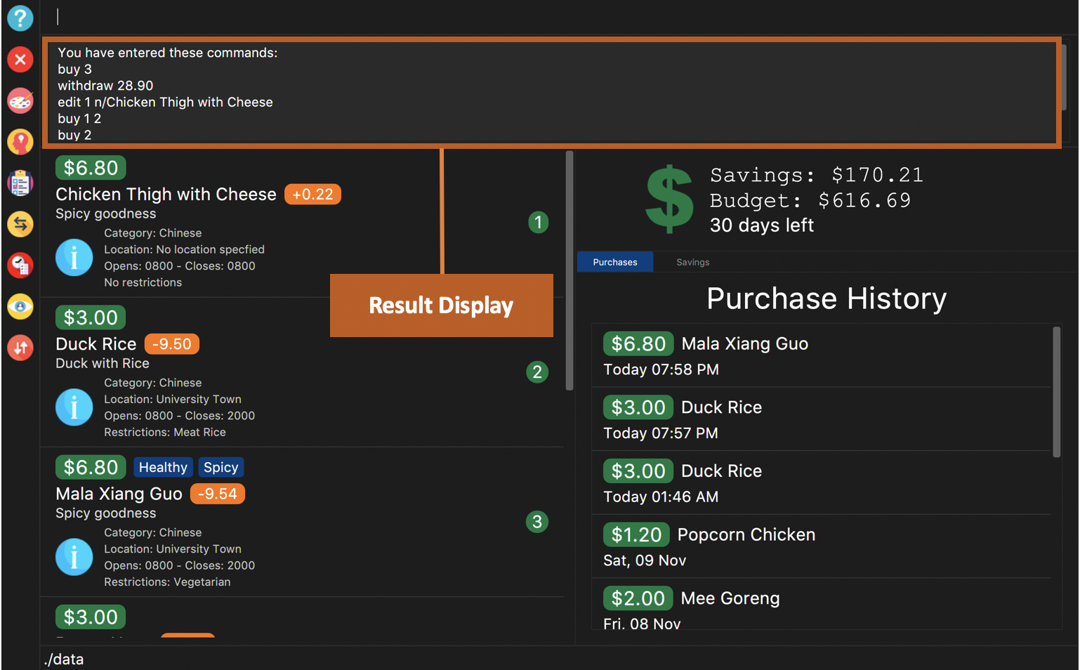
Figure 1. Example of view of $aveNUS after user inputs
history. History of previously typed command appears in the Results Display as shown. |
A message stating that "You have not entered any commands." is displayed if you have not input any commands prior to the call to history.
|
The history command will only display previous commands with no duplicate commands.Eg. typing history twice will only result in a display of history only ONCE in the Results Display.
|
Viewing information about a command: info
Displays the information of the command specified. A new window will be opened showing additional information about the specified command, usage example, and expected output of the command.
$aveNUS can only display one information window at a time. Therefore, subsequent usage of the info command will only
display the latest command specified.
|
|
You will see a window pop-up specifying the details of the command you wanted more information about. 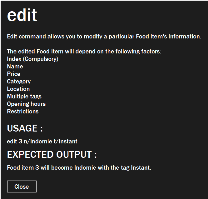
Figure 2. Example of view of information window after user inputs
info edit. |
Changing the application’s theme: theme
Changes the look of the application depending on the desired theme.
List of themes available are light and dark
The default theme of the application is dark
|
You are able to subsequently set the same theme one after another but it would not result in any change in themes. e.g. calling theme dark and then theme dark again will only result in one time change to dark theme.
|
|
The application’s theme will now change to dark theme. |
Contributions to the Developer Guide
This section shows the additions that I have made to the various features of the Developer Guide.
UI component
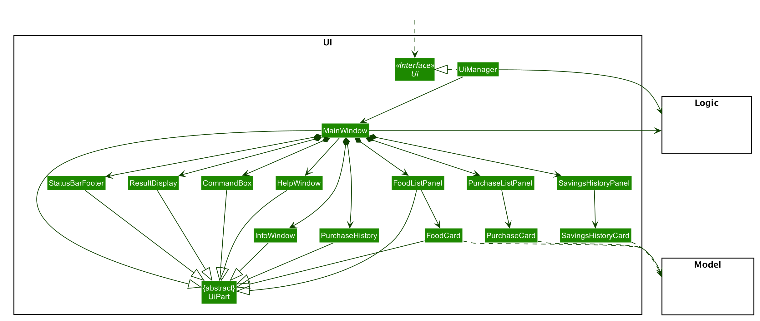
API : Ui.java
The UI consists of a MainWindow that is made up of parts e.g.CommandBox, ResultDisplay, FoodListPanel, PurchaseListPanel, SavingsHistoryPanel, StatusBarFooter, etc. All these, including the MainWindow, inherit from the abstract UiPart class.
There are pop-up windows that appear when user calls the InfoCommand or HelpCommand which is a new window with their own stages. The CSS files for each pop-up windows is taken from the MainWindow which ensures that they always match the theme of the MainWindow should the user decide to switch the theme while either pop-up window is open.
The UI component uses JavaFx UI framework. The layout of these UI parts are defined in matching .fxml files that are in the src/main/resources/view folder. For example, the layout of the MainWindow is specified in MainWindow.fxml
The UI component,
-
Executes user commands using the
Logiccomponent. -
Responds to the user’s keyboard and mouse input.
-
Pop-up windows respond to the buttons on the menu tab.
-
Button on the menu tab which acts as substitute for keyboard input for single-word commands.
-
Each usage of the menu tab buttons will update the Food list accordingly.
-
Listens for changes to
Modeldata so that the UI can be updated with the modified data.
Info Feature
The info feature allows users to view more information about a particular command. This can be done through calling the
info command.
Classes for info feature in Model
In order to support the info command, new classes were added that correspond to each command in the app.
This is to allow for easy access and also to better organize the information to be displayed for each commands.
These classes only has public fields without any methods as it is only needed by InfoWindow to access the information
Here are some example classes: AddInfo, AliasInfo, AutoSortInfo, BudgetInfo
Each of these classes contains these fields:
-
Command Word
-
Information
-
Usage example
-
Expected Output
Each of these fields have to be manually typed as it acts like an in-built user guide for the users who do not have access to internet connection, but would still like to know about the command.
Opening info card about a command
Command word to open up a new InfoWindow is info. Users are able to view the InfoWindow for each and every command
as long as the command exist within the app (There exist the class for such info card in the model).
For example, info add will open up a new InfoWindow about the command add.
The sequence window below shows how a sample info command is executed:
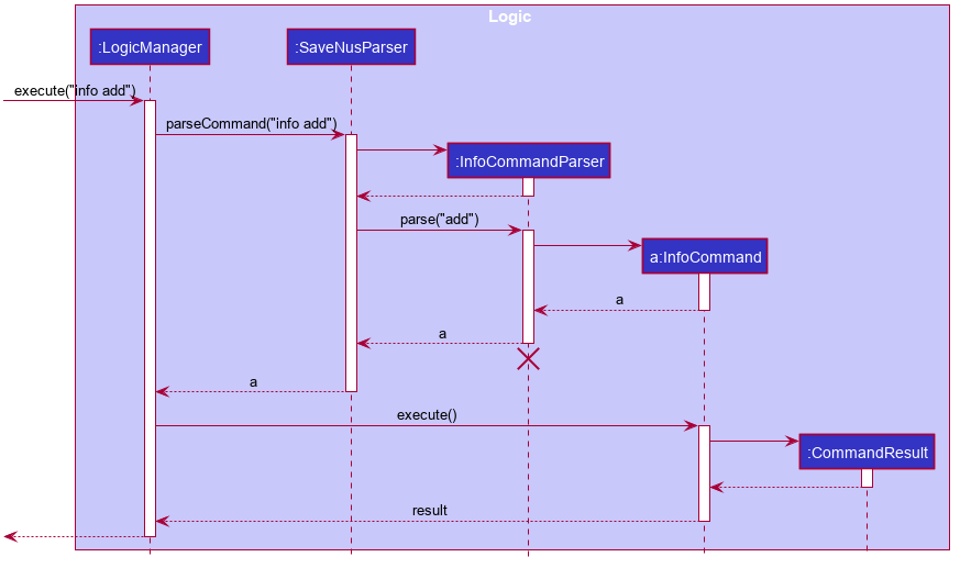
info commandThe following activity diagram shows how the info command works.
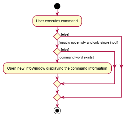
info commandDesign Considerations
Detailed below are our considerations when creating the Info feature.
Design considerations of InfoCommand class
Explained below are our consideration when designing the InfoCommand class.
| Alternative 1 (Chosen Implementation) | Alternative 2 |
|---|---|
Returning a specific message for each input command to create specific
|
Simply returning the input command’s output message.
|
We decided to go with alternative 1 and implemented InfoCommand class to just return a specific message for each
and every input command. Not only that this is much safer but this also allows similar commands to have standardized
output message e.g. like command and dislike command.
The hassle of having to create new field and object to be returned for every new command added is mitigated by the fact that we will not have to worry about similar output message for the commands resulting in a bug in the info feature.
Additionally, this implementation also allows a unique output message to be displayed on the ResultDisplay which
definitely adds more personality to the program and allows a better, more informative feedback to user to be displayed.
Basically the benefits of this implementation as mentioned, greatly outweighs the cost it takes to implement it and subsequent command addition would be much easier as it’s just repeated routine.
Design considerations on how to display the command’s information
Explained below are our consideration when designing on the best way to display the command’s information.
| Alternative 1 (Chosen Implementation) | Alternative 2 |
|---|---|
Creating
|
Displaying the information on the
|
We decided to go with alternative 1 where we just create a new window called InfoWindow to display the information.
Firstly, this allows us to format the information in a way to make it easy for the users to understand. Secondly, we
are able to fit so much more information in the new window and even possibly image guides which would definitely
help users understand the commands better.
Displaying the information on the ResultDisplay simply would not be helpful enough to the users especially with
information-heavy commands such as add and edit which would definitely not fit the small ResultDisplay screen.
Theme Feature
The theme feature allows users to change the look of the app. This can be done through calling the
theme command.
Changing the theme of the app
Command word to change the theme is theme. Currently there are only two themes available which are light and dark
theme. As such, the only valid commands are theme dark or theme light.
The sequence window below shows how a sample theme command is executed:
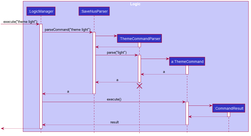
theme commandThe following activity diagram shows how the theme command works.
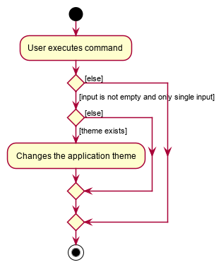
theme commandDesign Considerations
Detailed below are our considerations when creating the Theme feature.
Design considerations on how to implement the theme change
Explained below are our consideration when designing method to change the theme.
| Alternative 1 (Chosen Implementation) | Alternative 2 |
|---|---|
Using CSS styling and just simply changing the
|
Creating a class that automates the theme change according to color scheme.
|
We decided to go with alternative 1 and utilize StyleSheet instead of creating a class that automates the theme change.
This greatly improve the customization between themes and much easier to implement. THe greater customization option
allows for different themes to look distinct and also look better.
This implementation also allows for better organization of the themes which makes it easy to keep track of the different themes available. The space taken up by repeated components is not that heavy since the app itself is light.